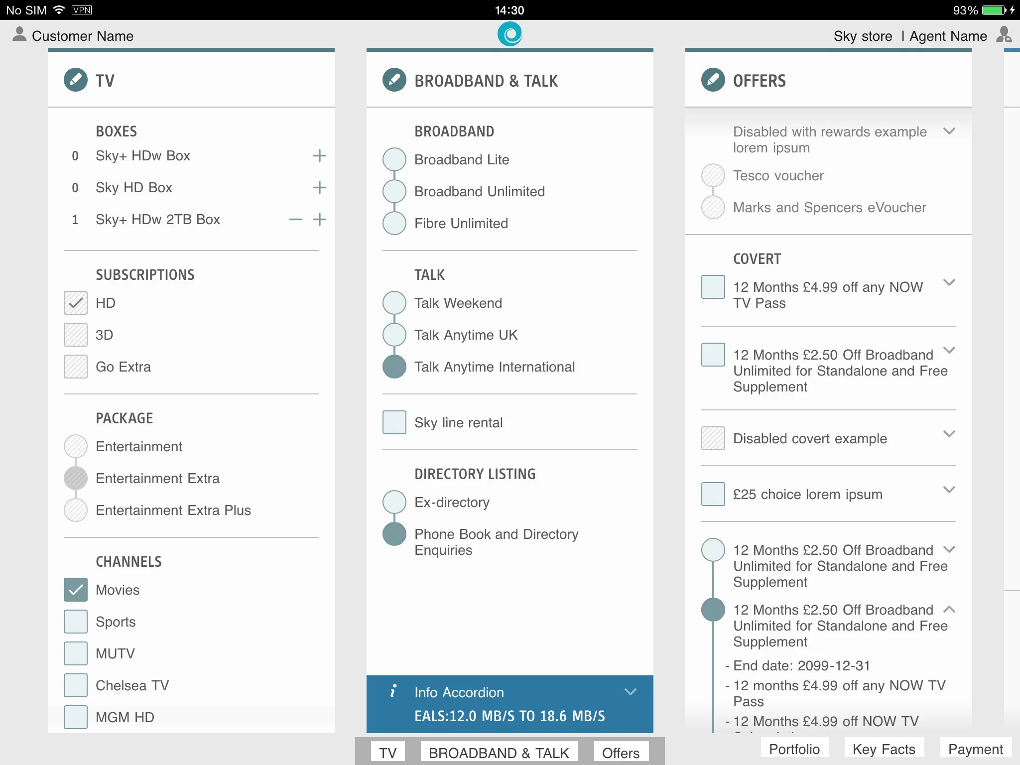
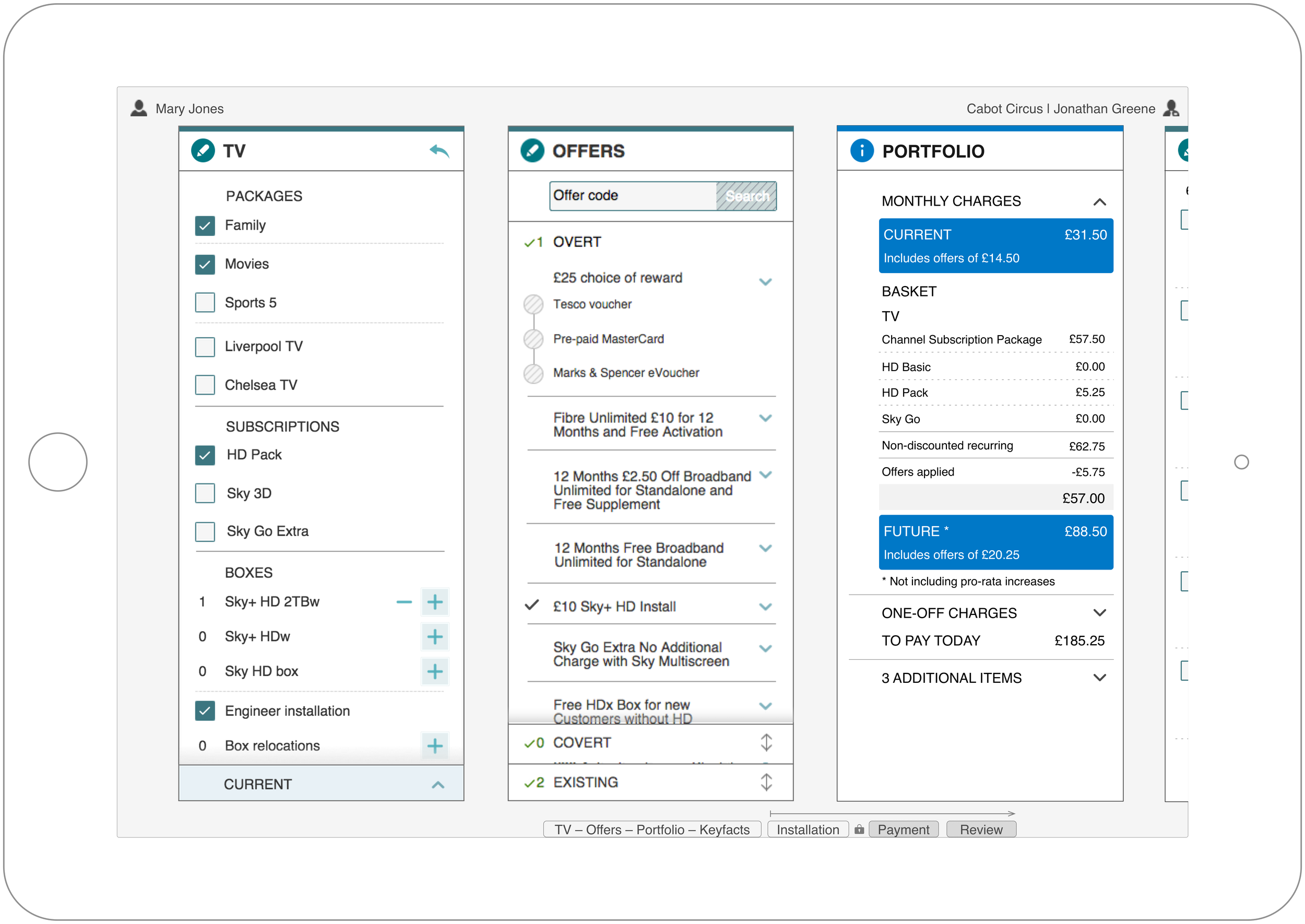
The Product Interface
The initial phase of the product involved iterations of user research, design, prototyping, testing of the prototypes and requirements harnessing. We delivered multiple work streams of the application in parallel.
- Agent Login and Setting of Telephony Status
- Eligibility checks of the caller
- Collect install address (present or future)
- Property Type
- TV Selection
- Broadband and Telephony
- Applying Offers
- Compliancy Issues for Distance Selling
- Select Installation / Activation Dates
- Payments and set up recurring payments
- Account creation
- Order Submit
- Error Handling
All of these work streams were managed by ensuring that the designs worked together as a single unit offering a single user experience that was coherent.
CONCEPT & MAPPING FOR NEW CUSTOMER MANAGEMENT SYSTEM
PHASE 1
When creating the phase 1 sales interface I worked with the Compliance teams to ensure that a dysfunctional system led to better compliany by all users. The wireframes below illustrate the design intent.
Resulting in a 58% reduction in miss-selling complaints to Ofcom with a positive impact on compliance adherence.
Compliance with the regulatory bodies which cover the BSkyB footprint is absolutely critical to the company’s growth and success. The improved interface has led to fewer compliance challenges which has transformed the relationship with Ofcom and other regulators.
PHASE 2
Wireframe document for demonstrating journeys and interactions to stakeholders and developers. Prototypes also created by UX team for testing with users for feedback on concepts and new functionality.
“Initially it looked too basic because you think it can’t look like this but still have everything there?... But it does! and that just shows how simple the layout is.”
- Retail agent feedback


